
- What makes a good letter template?
- Errors in email newsletter design
- Mobile adaptation is a must have
- Examples of templates that work
- What are AMP newsletters and do you need them?
1. What makes a good letter template?
Email marketing is more than just sending emails, it’s an important channel of communication between a brand and its audience. A good email template helps capture attention, increase engagement, and increase conversions. But what makes an email truly effective?
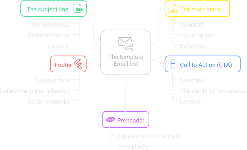
A structure that works
The best emails have a clear logical structure that helps the reader quickly understand the message and take the desired action. Here are the basic elements that every template should include:
- The subject line is the first thing the recipient sees in their inbox. It should be catchy, but not clickbait. A good subject line:
- Arouses interest or intrigue.
- Contains personalization (e.g., recipient’s name).
- It has concise content (up to 50 characters).
- A preheader is a short text that complements the subject of the email and helps the user understand the content of the message before opening the email.
- The main block is the main content that contains the key message. It should be:
- Structured (headings, paragraphs, bulleted lists).
- Visually appealing (images, infographics).
- Clearly formulated so that the recipient understands exactly what is expected of him.
- A call to action (CTA) is a button or link that prompts the recipient to take a desired action (buy, sign up, download a file, etc.). Important aspects of an effective CTA:
- Highlight by color or size.
- Clarity of wording (“Get a discount”, “Download for free”).
- Laconicism.
- Footer is the bottom part of the email that contains contact information, unsubscribe links, and social media.
“A clear structure increases readability and conversion. If a user has difficulty finding important information, they will simply close the email.”
Content: what to write in letters
Content plays a key role in how an email is perceived. Here are a few principles to help make it effective:
- Personalization : Use the recipient’s name and personalized suggestions based on their past activity.
- Benefit for the reader . Don’t just sell, but solve a problem or offer something of value.
- Brevity and specificity . People don’t read long emails, they skim them. So avoid unnecessary “water”.
- Use visual elements . Images, icons, GIF animations make content more attractive.
Example of a good letter structure
Let’s say you’re sending an email with a discount on your product. Here’s how it might look like:
Subject: “[Name], today only — 20% off !”
Preheader: “Don’t miss out on this great deal — it’s only valid for 24 hours.”
Main unit:
- Product photo.
- Brief description with benefits.
- “Get discount” button.
Footer: Contacts, social networks, unsubscribe link.
“Personalized emails have a 26% higher open rate compared to regular mass mailings.”
2. Errors in email newsletter design
The design of an email newsletter has a huge impact on whether a user opens the email, reads it, and takes a targeted action. However, many companies make common mistakes that reduce the effectiveness of their newsletters. Let’s look at the main problems and ways to avoid them.
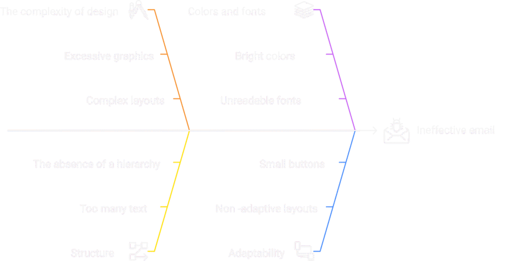
2.1. Excessive design complexity
Some brands try to make their emails too flashy by adding too many graphics, complex layouts, and animations. As a result:
- Sheets load slowly.
- They are poorly adapted to mobile devices.
- The main message gets lost in the visual noise.
“A simple, clean design with a clear hierarchy of elements always works best. The letter should be clear at a glance.”
✅ How to fix it: Use a minimalist approach – limit colors, fonts, and images. Try to stick to one main visual accent.
2.2. Lack of a clear structure
Readers won’t spend much time on your email – you have a few seconds to grab their attention. If the structure is poorly thought out, the user may close the email without even finishing reading it.
Typical errors:
- Too much text. Solid blocks of text without visual accents are tiring.
- Lack of clear hierarchy. If the text is the same size, there are no headings or subheadings, it is difficult to understand the main point.
- Multiple calls to action. If there are too many CTAs (Call-To-Action) in an email, the user may get confused.
✅ How to fix:
- Divide the text into short paragraphs.
- Use subheadings, lists, and bold for emphasis.
- Highlight the main CTA button so that it is visible and attractive.
2.3. Wrong choice of colors and fonts
Colors and fonts play a key role in how an email is perceived. Some companies use too bright or contrasting combinations, making it difficult to read.
“The design of the letter should be pleasing to the eye – don’t use overly acidic colors or non-standard fonts that are difficult to read.”
✅ How to fix:
- Use a branded color palette, but don’t overdo it with brightness.
- Choose readable fonts (Arial, Roboto, Open Sans, Helvetica).
- Maintain contrast between text and background.
2.4. Lack of adaptability
According to statistics, over 60% of emails are opened on mobile devices. If your email doesn’t adapt to different screens, it may display incorrectly or be difficult to read.
Typical problems:
- The text is too small or too large.
- The image is not scaled.
- The buttons are too small to press on a smartphone.
✅ How to fix:
- Use flexible layouts (responsive design).
- Check your email on mobile devices before sending.
- Make the buttons large (minimum 44x44px for easy clicking).
2.5. Incorrect use of images
Images can make an email more attractive, but they don’t always display in email clients and can also slow down the loading of the email.
Typical errors:
- Lack of alt text – if the image doesn’t load, the user won’t understand what it means.
- The letter consists only of images – some email services block such letters.
- Large files – large images make the email slow.
✅ How to fix:
- Always add alt texts to images.
- Combine text and images so that the letter remains clear without pictures.
- Optimize the size of images before uploading (e.g. via TinyPNG or Squoosh).
Result
The design of your email newsletter should not only be beautiful, but also effective. By avoiding these mistakes, you will increase conversion and improve interaction with your subscribers. The main rule is to make your emails convenient, structured, and responsive.
3. Mobile adaptation is a must have
In recent years, mobile devices have become the main tool for viewing emails. According to statistics, more than 60% of users open emails on smartphones. If your email looks bad on a mobile screen, it can simply be closed or deleted without even reading it. Therefore, adapting email design for mobile devices is not just a recommendation, but a necessity.
Why is mobile adaptation critical?
Have you ever opened an email where the text was so small that you had to manually enlarge it? Or the CTA button was so small that it was difficult to press with your finger? These are typical problems that arise when an email is not optimized for mobile devices. In today’s realities:
- More than half of emails are opened on smartphones — and if a user can’t read or interact with your email, they’ll simply close it.
- People read their mail on the go — they won’t waste time on an inconvenient letter.
- A bad experience reduces brand trust — an unadapted email can create the impression of poor service.
“The first few seconds after opening an email determine whether a user will read it. Poor mobile design means instant loss of attention.”
Basic principles of mobile email design
To make your emails look good on mobile devices, follow these guidelines:
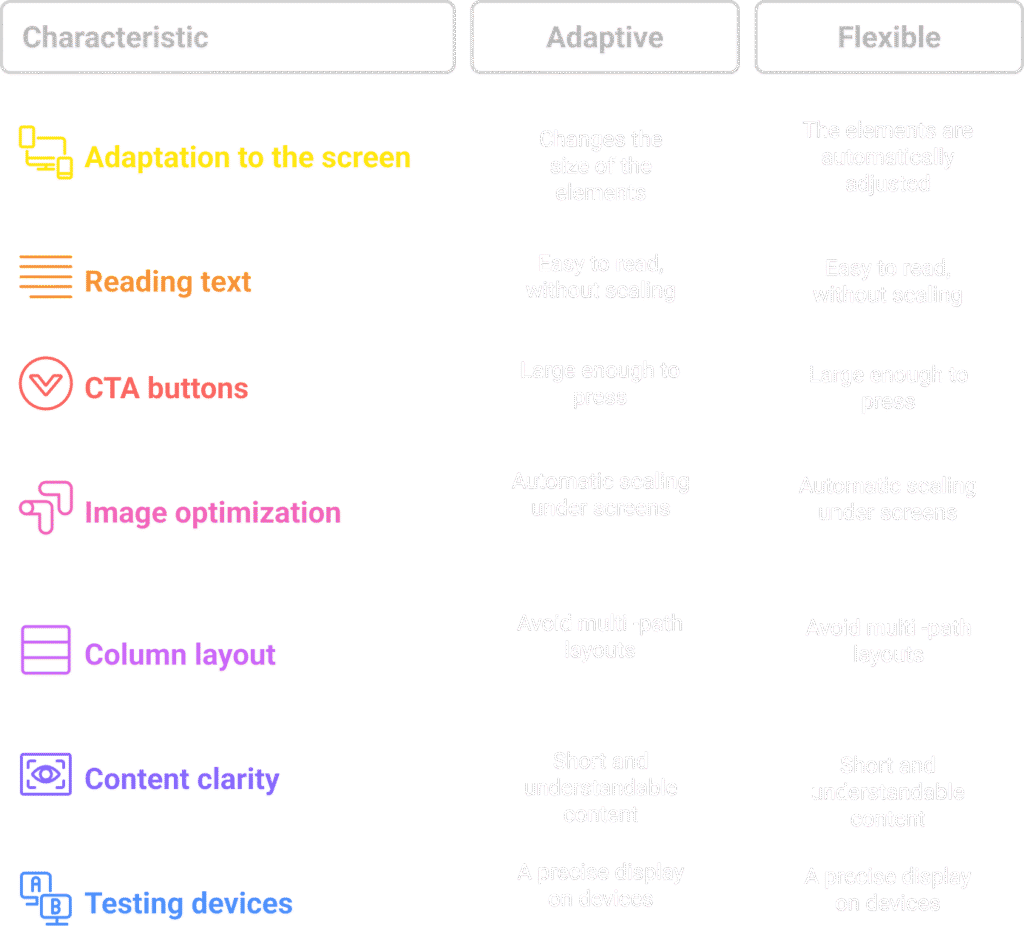
1. Use responsive or flexible design
There are two main approaches to mobile optimization:
- Responsive design – uses media queries (CSS) to change the size of fonts, images, and buttons depending on the screen size.
- Flexible design (fluid) – uses relative units of measurement (% instead of px) so that elements automatically adjust to any screen width.
2. Large and readable text
The text in the letter should be large enough to be easily read without scaling. Recommended sizes:
- Headers: 22-28 px
- Main text: 14–18 px
- CTA buttons: 16–20 px
3. Convenient CTA buttons
Users click on buttons with their fingers, so they should be large enough (minimum 44×44 px) and have enough space around them. It is also worth using bright colors to make CTA buttons stand out.
4. Image Optimization
Images must:
- Automatically scale to fit the screen.
- Have an alt attribute so that text is displayed if the image fails to load.
- Be lightweight (up to 200 KB) to load quickly even with a weak internet connection.
5. One column instead of complex layouts
On mobile devices, multi-column layouts can look chaotic. It’s best to use a single-column design with a width of 600px or less.
6. Short and clear content
People scroll quickly, so your text should be clear, concise, and well-structured. Use:
- Short paragraphs (2–3 lines)
- Lists for important information
- Highlighting key points in bold
7. Testing on real devices
Emulators are great, but real testing on smartphones gives a more accurate idea of how your email will look. Use services like Litmus or Email on Acid to see how your email looks on different devices.
“A mobile user is an impatient user. If your email is inconvenient, they will simply close it.”
How to check if your email is mobile-friendly?
Before launching a newsletter, it’s worth conducting a few tests:
- Open the email on different devices (smartphone, tablet, laptop)
- Check download speed
- Click on all links and buttons
- Make sure the text is easy to read
Let’s summarize
Mobile-friendly is not just a trend, it’s a necessity for modern email marketing. If your emails aren’t mobile-friendly, you’re missing out on a large portion of your potential audience. By using responsive design, optimized images, readable text, and large CTA buttons, you’ll maximize the effectiveness of your email campaigns.
4. Examples of templates that work
Creating an effective email template is an art form that combines thoughtful structure, attractive design, and compelling content. Let’s take a look at some proven templates that demonstrate high open, click, and conversion rates.
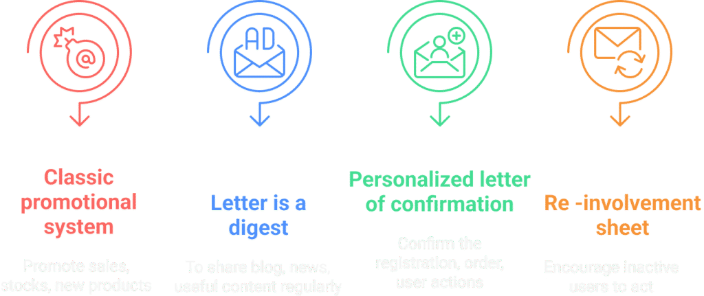
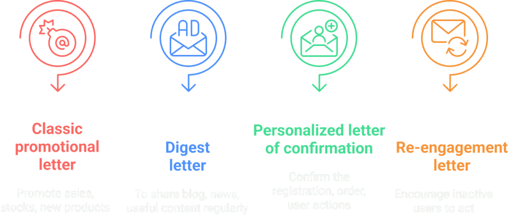
4.1. Classic promo letter
If you want to notify your subscribers about a sale, promotion, or new product, a promotional email is the perfect format.
Structure of an effective promo letter:
- A clear headline . It should immediately explain the value of the offer.
- Product images . Quality visuals attract attention.
- Short but compelling text . Why is this proposal important right now?
- Bright CTA (Call-to-Action) . The call to action should be clear: “Buy Now”, “Get a Discount”, “Learn More”.
“Too much text in a promotional email can turn users off. Clear structure, visuals, and conciseness are the keys to success.”
4.2. Digest letter
If you have a blog, company news, or useful content that you want to send to your subscribers regularly, it’s worth using the digest format.
What works in the digest:
- Clear formatting . Dividing information into blocks, highlighting key points.
- Images or icons : These help break up text and make it more appealing.
- Full text hyperlink . Allows interested readers to go to the site.
“Regular digests are a great way to keep subscribers engaged and increase traffic to your site.”
4.3. Personalized confirmation email
If your business involves registration, purchase, or other actions, you need transactional emails. For example, a registration or order confirmation email.
Elements of effective confirmation:
- Personalization : Use the customer’s name and order details.
- Friendly tone . The letter should be not only informative, but also pleasant.
- Additional call to action . For example, “Add this address to your contacts to stay up to date with important updates.”
“Even a transactional email can be a powerful marketing tool if done right.”
4.4. Reminder or re-engagement letter
Not all users will make a purchase or return to your site right away. Email reminders are a great way to encourage them to take action.
What to consider in such letters:
- “Long time no see” format . If the user has not visited the site for a long time.
- Abandoned Cart Reminder : If the item is still waiting in the cart.
- Personalized recommendation . Based on previous purchases.
“A gentle reminder without being pushy often works better than aggressive discounts.”
Result
The right email template is not just a pretty newsletter, but a strategic communication tool. Use proven formats and adapt them to your audience to achieve maximum results.
5. What are AMP newsletters and do you need them?
AMP (Accelerated Mobile Pages) for email is a technology that allows you to add interactivity to emails. With AMP, users can perform actions directly in the email without going to the website.
5.1. Main features of AMP newsletters
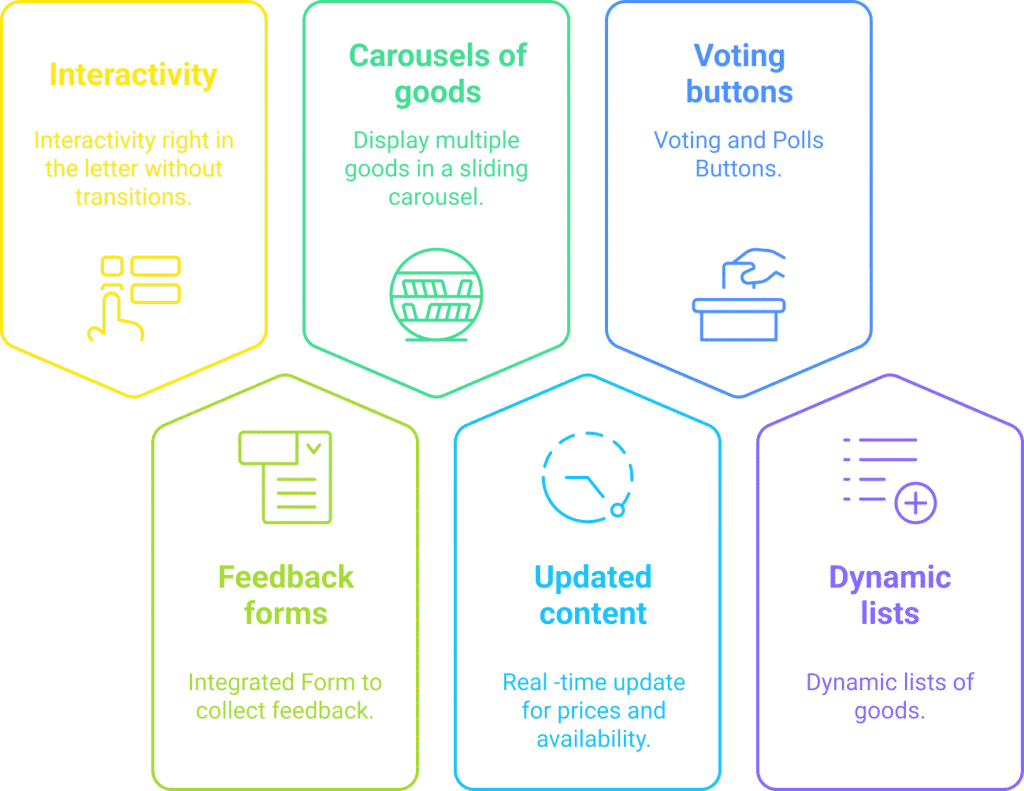
AMP allows you to add the following interactive elements:
- Feedback forms without having to go to the website.
- Carousels of products that can be scrolled through directly in the letter.
- Updated content (for example, current price or product availability).
- Voting and survey buttons .
- Dynamic product lists based on the user’s previous purchases.
5.2. Benefits of using AMP in newsletters
- Increased engagement : Interactivity attracts more attention.
- Reducing the number of clicks . Fewer conversions = less chance of losing a customer.
- Personalization : The ability to show different content to different users.
5.3. Limitations of AMP newsletters
- Not all email clients support AMP . Gmail, Yahoo, and Mail.ru work with this technology, but other email clients may not display interactive content.
- Additional validation required . To send AMP emails, you need to verify your domain and be verified by Google.
- Development difficulty : Creating an AMP listing requires HTML, CSS, and AMPscript skills.
5.4. Who should use AMP newsletters?
AMP is suitable for e-commerce, service companies, media, and anyone who wants to increase engagement with email campaigns. If your audience primarily uses Gmail or Yahoo, it’s worth trying this technology.
Conclusion
Creating an effective email template is a combination of knowing your audience, good design, and relevant content. Using responsive design, personalization, and interactive elements like AMP can help improve engagement with your subscribers. The key is to test different formats, analyze the results, and constantly improve your email marketing approach.


